Cincoze
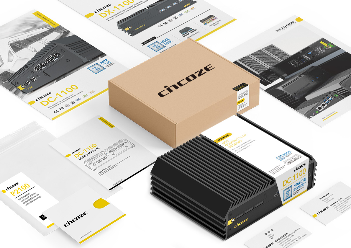
德承是一間獲獎無數的工業電腦研發與製造銷售商,因為旗下產品種類繁多,尺寸外觀與功效都大不相同,所以產品識別與企業識別的高度連結尤為重要。
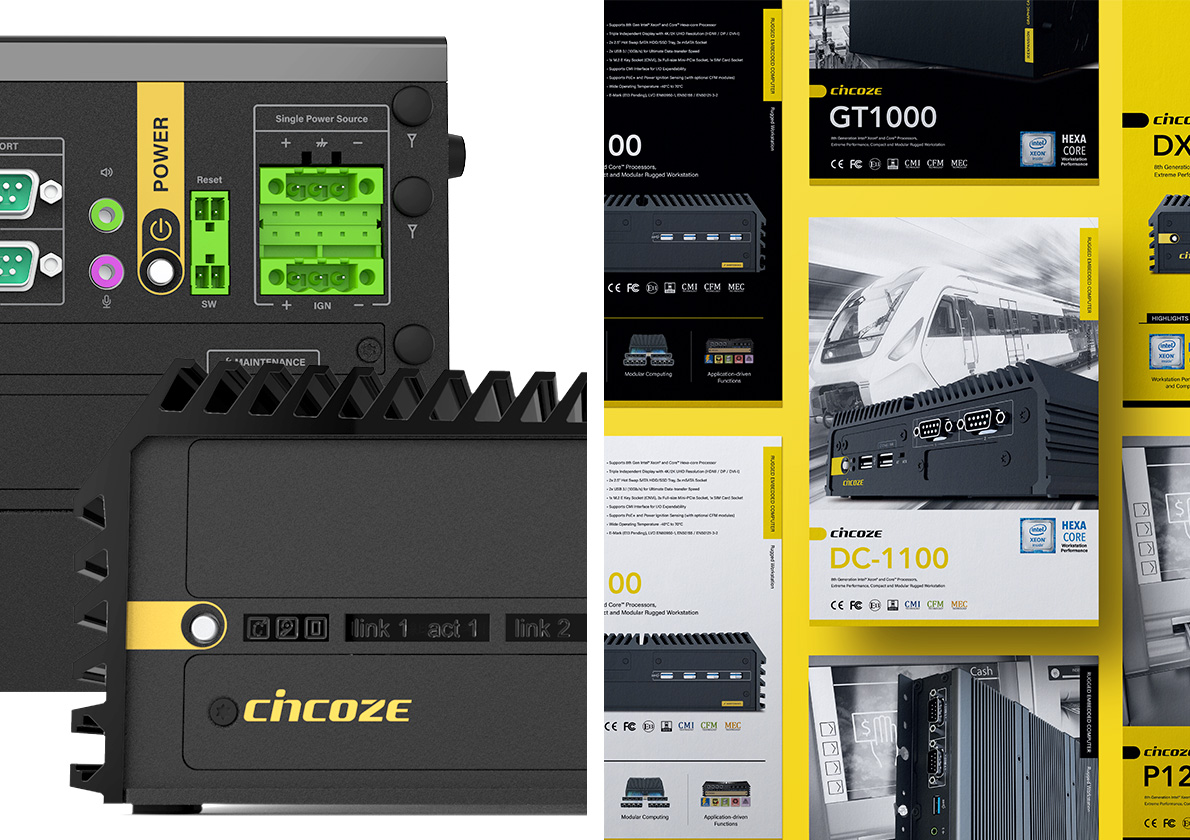
可為設計在眾多機器中找到了圓形電源鍵這個共通點,以“起點”作為核心概念,配合客戶品牌的專業形象,使用簡潔的輔助圖形在機身上清楚標示電源鍵,並在後續的應用項目中皆以此圖形作為視覺起點,來呼應電源鍵的功能以及品牌新形象“Start from here.”,並藉此強化產品識別與企業識別的連結。
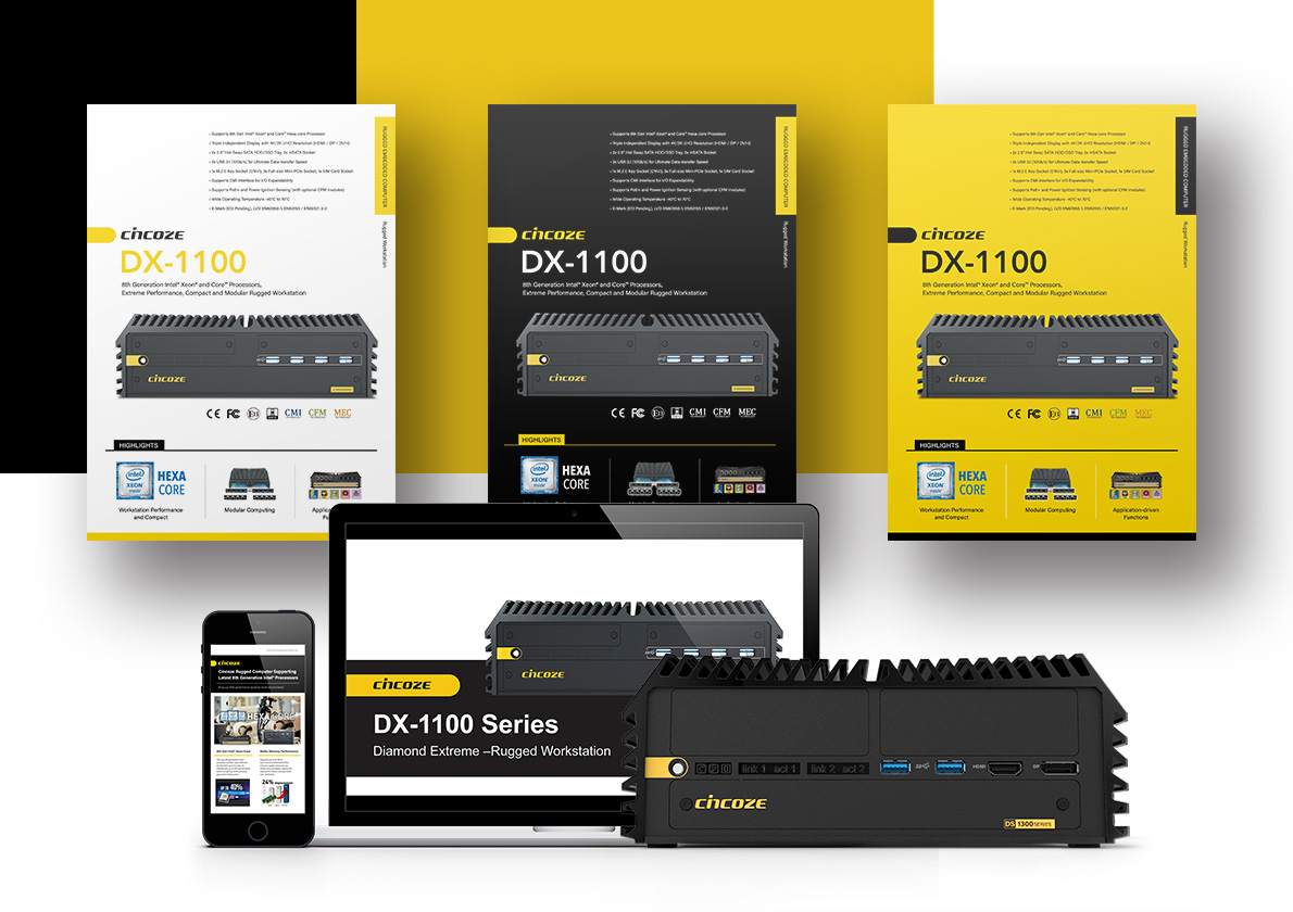
顏色方面,因應機身皆為深色,且工業電腦放置環境較為苛刻,故以選擇高對比並具有工程感的黃色為主色搭配黑色為企業標準配色。簡潔的圖型以及高對比的配色讓全線產品都能維持品牌的視覺連續性與穩定性,並在市場中能有效提高識別度與信任感。
Cincoze is an award-winning industrial computer developer and manufacturer. They provide professional manufacture and systematic solutions for their clients. In addition, they monitor and optimize the process of quality control to fulfill high expectations from their customers.
Due to the diversity of Cincoze’s products, our designer spent time on finding the power button as the starting point. To match the professionalism of the client, we created a simple shape on top of the power button to echo the idea of a new image “Start from here”. Therefore the connection between product identity and corporate identity were enhanced.
Considering the harsh environment of industrial computers usually located, our designer made a decision on yellow to emphasize the contrast and industrial vibe. Simple shape and high-contrast color scheme together maintained the visual continuity and stability of the brand. In addition, it improved the brand identification and trust level in the market.


