龍機
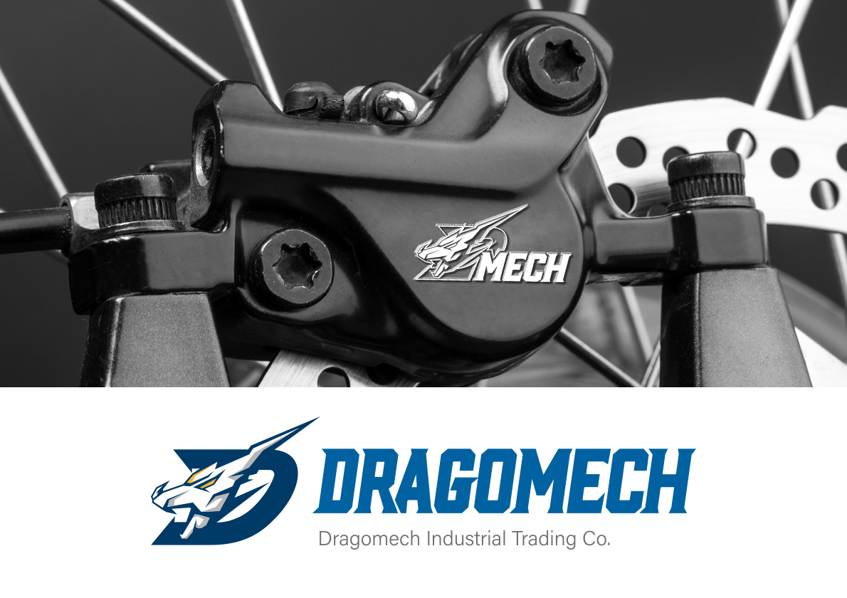
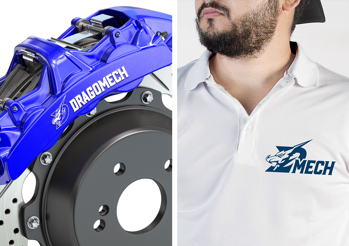
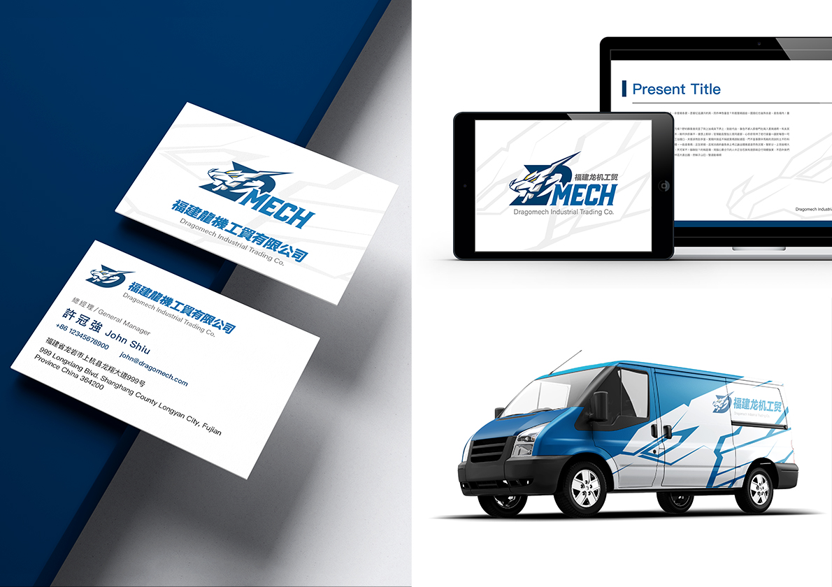
福建龍機工貿位處中國福建省龍岩市,是當地的汽車零件大型供應商。設計師利用龍型機甲可靈活變形的「折疊」概念,使用龍與盔甲為主要元素,搭配三國語言的商標文字(繁中、簡中、英文),可自由組合擴展或簡化,讓商標組合在維持視覺識別的同時,也能彈性應對不同尺寸的媒材。設計師同時使用了符合客戶產業的色彩計畫,並有針對深色背景的單色版商標,讓整體的視覺識別充滿變化但又具有相同的調性。
DM (Dragomech Industrial Trading Co.) is located in Long Yan City, Fu Jian Province, China, and they are one of the main auto parts suppliers. Our designer borrowed the concept of flexible transformation from an anime dragon knight to construct the visual identity. The dragon and armor as the main elements going with trilingual letters (traditional Chinese, simplified Chinese, and English) could be formed together or applied solely on different media with various sizes. Furthermore, a color scheme that suited the auto industry and additional monochrome logo for a dark background built up a flexible and synchronized visual identity.


